
Top 10 Email Design Trends To Look Out For In 2020/2021
What is the future of email marketing?
While communication apps like Slack have been called “email killers,” email isn’t going away anytime soon. In 2019, global email users amounted to 3.9 million -- a figure that is predicted to grow to 4.3 million by 2023. And while social media marketing has been increasingly successful as well, there oftentimes is less competition for your message in your audience’s inbox than on their Facebook news feed.
Subject lines and body copy are vital to an email campaign’s success, but the content of an email is only as good as its design. Emails need to be laid out in a way that is easy for consumers to scan, know what the email is asking them to do, and take action.
The concept of email marketing is more than 40 years old. Yep, you read that right. For that reason, marketers need to stay ahead of new digital tools and technologies that optimize email design -- making it both easier on them and their readers.
Ready to learn about the trends that have cropped up throughout 2020? Keep these 10 email design strategies in mind to create visually appealing emails that will help you engage your audience.
1. AMP for email
AMP for email -- a functionality announced by Google back in early 2018 -- was finally made available for a wider audience in 2019.
Product manager of Gmail, Aakash Sahney, calls it a “a powerful way for developers to create more engaging, interactive, and actionable email experiences.” While technically not a design principle, AMP allows marketers to make their emails more interactive.
The email format provides a subset of AMPHTML components for use in email messages, which allows recipients of AMP (Accelerated Mobile Pages) emails to interact dynamically with content directly in the message. They can RSVP to an event, make a booking, and leave feedback all within the body of the email without going to separate pages.
AMP-powered solutions will help improve customer interactions within an email. The brand new technology is now supported by Gmail web, Gmail app on Android and iOS.
2. Minimalist design
Minimalist design prevails throughout all marketing mediums -- from print to digital, from email to web design. Here are some elements of minimalist design.
Muted Colors: Like dark mode, soft color palettes can alleviate symptoms of eye strain.
White or Negative Space: Effective use of white space allows the brain to scan, interpret, and break down elements into digestible pieces. It lets readers focus on only the most important elements of the email.
Simple Typography: The first question you should ask yourself about your font pertains to legibility -- the ability to distinguish one letter from another. You spend almost twice as much time reading italic and decorative fonts as you do reading default and easy-to-read ones.
No matter how much information you need to convey with your email, less is almost always more. It’s best to avoid overcrowding your email with extra images, graphics, or text that may not contribute to the overall message and action you want your consumer to take.
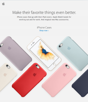
Consider this email from Apple:
With a minimalist design, simple font, and only a few iconic images, this email is both visually powerful and digestible at the same time.
3. Interactivity
Static email content is pretty much dead, and interactivity is here to stay.
And while AMP does incorporate many interactive elements, interactivity differs from the AMP for email technology. 82% of email users prefer receiving emails with interactive content over traditional passive messages.
There are many ways to introduce interactivity to your emails -- from games to artificial reality to other forms of rich media. Even image carousels, menus, and some clickable items can be considered interactive.
Interactive content is evolving in 2020 and will take off even more in 2021. Studies show that interactive emails increase click-to-open rates by an astounding 73% -- and by 300% when you add video to your emails.
4. Dark-mode
Do you prefer reading on a dark or light background?
Last year marked the adoption of dark mode by three of the world’s top service providers: Apple, Google, and Microsoft.
As the usage of digital devices continues to rise, dark mode is oftentimes the preferred user experience setting. In fact, 80% of American adults use digital devices for more than 120 minutes each day and 67% using more than two devices simultaneously.
Dark mode rose to popularity because it removes blue light -- allowing consumers to relax their eyes and avoid the jarring brightness of a normal smartphone screen. Not to mention, it can improve content readability and scanability. And many people actually just have a preference for darker interfaces.
Here are some of the benefits of dark mode:
It minimizes blue light impact
It improves readability and scanning
It’s more convenient to use in a low-light environment
It saves mobile charge by 50% for Android devices with OLED screens
5. Think beyond the conventional column layout

Emails typically follow a traditional column layout with elements stacked: an email header, product image, product description, information about the offer, and finally an email footer. Emails can come in the form of a one-, two-, three- or even four-column design.
But in 2020 and beyond, email designers are opting for broken grid layouts. Email designers can use design software to create graphics that give the illusion that there aren’t columns.
Take a look at Chobani’s broken grid layout:
The curvature of the text, the unique placement of products, and various-sized graphics make the email more readable and visually appealing.
6. Bold typography

Typography in email has been a hot topic over the past couple of years.
Historically, choosing the right font for an email wasn’t that daunting -- there were only a limited number of web safe fonts. But with the proliferation of web fonts, web designers can be more creative with their typography. This has led many brands to experiment with more bold typography, especially in the headers and taglines in their emails.
The reason for this trend cropping up? Big, bold fonts are just another way to command the attention of the reader, make a statement, and push key messages.
While many email marketers rely on powerful images to capture the reader, this shift to embracing bold fonts is often a successful alternative. Take a look at this email from GoPro:
Bold fonts appear not only in the email header, but also in the section headers -- engaging the reader as they scroll through the email.
7. Video in email
Videos are fun to watch -- not to mention, they are shareable and can save tons of time.
Incorporating videos in your emails can help you entice more clicks and readership. Your open rate could go up by 19% if you incorporate the word “video” into your email subject line.
Most major email platforms -- including Gmail, Yahoo, and Outlook -- don’t yet support video playback within the email itself. Instead, create a thumbnail image and use the image as a clickable link leading to the video on your website.
8. Animation
Not only does movement get people’s attention, but it can set your email apart from a static one. Even just a little bit of movement can be enough to surprise your reader and trigger their interest.
Up to this point, animation has primarily been used in email marketing to entertain and make an email more dynamic. However, its purpose is becoming more functional. Many marketers are using custom animations to highlight the technical characteristics and main benefits of their products.
Animations typically work well with otherwise lightweight emails, with few heavy text or image elements. This will help decrease the loaded weight, or the speed of download when a user opens the message.
When we talk about animations, we mean GIFs, APNGs, and CSS animations. Here is a brief rundown of each type:
GIF: GIFs are the most common type of animation. Similar to a flipbook, GIFs rapidly display a series of images to produce the illusion of motion.
APNG: APNG is an alternative to the regular GIF. Because it leverages higher quality images, it is expected to be quite popular in 2020 and beyond. APNGs can also support more colors and transparency. The format is not yet supported by the Gmail and Outlook app, however, which could account for about a third of your users.
CSS: CSS animations are typically applied to buttons and images, and they usually indicate a CTA (call to action). With CSS animations, you can animate or apply a hover effect to the buttons in your emails.
9. 3D Images
3D and isometric images, illustrations, and graphics have been gaining a lot of popularity over the years.

In contrast from flat images, 3D graphics and images add depth and volume to your emails. The 3D effect also helps provide another dimension to the overall email design.
When incorporating 3D effects, it’s often best to just focus on one element. Add too many 3D elements, and you may overwhelm your readers. Make sure to make your 3D element big enough, place it in the middle, and don’t let it overshadow other important parts of your email, like your call to action. Lyft does a good job of implementing all the above mentioned.
10. Abstract and organic shapes
Abstract design inspires engagement -- it demands a second, third, and sometimes fourth look from the reader in order to understand it.
Similarly, organic shapes mark a departure from rigid grids, sharp edges, and conventional shapes to allow brands to get creative. With elements like curved lines, graceful arcs, and fluid-like blobs, organic shapes make design softer and more inviting.
Many brands are starting to incorporate organic shapes to help spice up their email designs. Whether you use them to highlight product photos or add decoration to a graphic, there are many ways to design using these shapes.
It’s Your Turn
Email marketing remains one of the most successful and popular marketing forms. As such, great email design should never be underestimated. Just ask Apple, whose success has largely been fueled by its signature sleek design across all mediums and devices.
These 10 ideas will not only help you create a visually appealing message, but they may also help increase open rates and conversion rates, helping you retain a more loyal customer base.